 ²
²
 New online editor in beta
Like calculator programming? Spend a lot of time online? Following the success of the online ORG assembler, ClrHome is announcing the new Integrated Editor System, an online IDE for TI-BASIC, Axe, and Grammer projects. Integrated image and code editors with inline sprite editing, autocomplete, and many other features helps to simplify programming for calculators online.
 ORG autocompletes!
The ORG online Z80 assembly IDE is now better than ever with such essential editor features as syntax highlighting and instruction autocompletion. As always, the webapp allows you to manage, host, and build your Z80 projects online for a variety of platforms. Or you could simply use it as an easy way to play around with Z80 assembly without ever having to install an editor or assembler.
 Fruit Ninja released
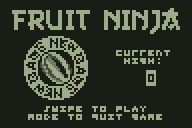
One small experimental calculator project turns out to be far more successful than first hoped. Besides featuring some highly detailed 3D animated graphics, the Fruit Ninja project introduces a strange but satisfying new way to play calculator games—by swiping your fingers across the keypad, as if it's a touchscreen on your calculator.
 One major feature request shmibs and I have taken on is the ability to create grayscale sprites and maps with our tools. It's been requested for a while now. Considering how easy it is to create three- or four-level grayscale graphics with Axe, grayscale support should have been a no-brainer from the beginning. Unfortunately, both projects were designed with monochrome graphics in mind, and the addition of grays would be a huge change.
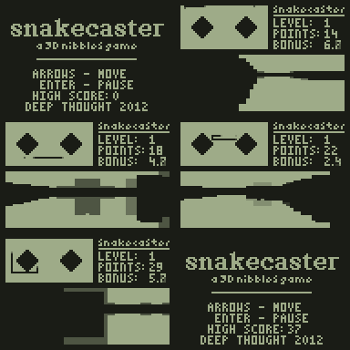
 And that's the story of Snakecaster, the completely overkill Snake game. I had to learn raycasting and other random stuff in order to have any idea how to make it, so it beats Minesweeper for the most effort I've spent on graphics. (By the way, if anyone out there is interested in learning raycasting, there used to be a really awesome tutorial at http://www.permadi.com/tutorial/raycast/index.html. It seems to be down now, but you can get the whole thing at the WayBack Machine. Seriously, there's something magic about that tutorial.)
 The second round was to make a "Paint" program. The main goal for mine was to make it as intuitive as possible. It turned out that I never used it myself once the contest was over, but apparently some people find it still useful, so you can download it here. (Don't bother asking me for help with drawing Homer Simpson—that sample image was a product of two minutes of Google Images, Gimp, and SourceCoder 2.) I guess since 100% of my effort went into graphics in that program, it beats Snakecaster for the record amount of effort I put into graphics, in a sense.
 Well, here it is. If you don't know about it yet, watch this video of it in action. The plan was to take a game that relies on a touchscreen and somehow adapting it so that I could play it in class—yet another ridiculous idea.
 Along the way, I actually started to enjoy making sprites, especially 8x8 monochrome ones. If you need help with some random sprites, shoot me an email or PM, because I might just do it for fun.
 tileIt! is a sprite and tilemap editor made with Axe. It means to simplify tilemap creation by first providing a robust sprite editor (with features such as rotation, reflection, and shifting), then allowing you to create a map using the sprites you make. In addition, sprites can be "played" as an animation, which should help with creating animated sprites. Your sprites and map can then be exported in a variety of formats, including as picture variables, as a TI-BASIC matrix, as Axe source, or as an appvar for transfer.
 Pixelscape was a completely separate project—an online tilemap and sprite editor inspired by Aichi's now-defunct A·Sprite and A·Map. It has almost identical features as tileIt!: the same rotation, flipping, and shifting transformations, the same form of animation playback, and the same concept of using the created sprites to easily build a tilemap. It can also export in a variety of formats including picture variables, assembly source, and Axe source with optional run-length encoding. You can also copy, paste, and undo changes with the common keyboard shortcuts. In addition, when I found out how similar this was to shmibs's project, I made sure to make it compatible, so you can both upload and download sprites and tilemaps as tileIt!-format appvar files. (At one point I seriously considered renaming it tileItOnline!, but I'd already made that awesome logo.)
 And now I'm back to working on Contra. Besides making some much-needed sprite changes (more are on the way, in the name of visibility), I've also re-implemented moving enemies (which can now jump around on platforms), added swimming, and made jumping and scrolling completely smooth. Even with that, the program still has a delay to slow down each frame (on a TI-83 Plus, too), so I'm still free to add falcons and those flying football-shaped things.
 My other planned entry, Minesweeper, could have been an update to my first (simpler) Minesweeper port, but it's really a complete rewrite. This time, it features flood-filling, a white-on-black theme, and the biggest effort I've spent on graphics for any game. Ever.
 Back when I released Simul, it was my best Axe game ever. It was my first Axe game ever, and it was cumbersome at best. To play the final stage, Stage IV (dubbed "fourplay" because—well, you'll see), you needed to stretch both thumb and index finger (on both hands) to false arrow keys buried in the middle of the keypad.
 Another issue with the old version was that the game ended as soon as you died in any of the minigames, so even getting to Stage IV was nearly impossible, even at the slow speed. That's been changed too. In the new version, only your progress in the current stage is reset when you fail a game; you can keep playing, but your death count is tracking your progress all the while and leaves an impact on your final score. And yes, there are scores this time.
 For those of you who have never played Simul before, it's essentially a game of multitasking. In Stage I, you switch among six minigames (Pong, Falldown, Avalanche, Jump, Tunnel, and Obstacles), playing each one for a few seconds before switching to the next. Your only goal is to keep alive in each minigame for six games in a row.
 When you reach Stage II, you're presented with a different screen: one split into two halves, with each half controlling a game. Pass six more sets of games and you reach Stage III, where (as expected) you play three games at a time. The final stage is Stage IV, where you need only pass six more sets to win, leaving you in infinite mode.
Welcome! ClrHome is a site and programming group with a variety of upcoming projects and finished products for the Texas Instruments line of graphing calculators, as well as an extensive collection of popular resources to help you make your own programs.