If you belong in that
half of the Internet that visits Google every day, you'll probably have noticed by now that the search engine (really? just a search engine?) got a makeover today.
Yet again.This time, Google's changed their color theme, and not just to make the blue lighter or the shadows more subtle. No, they seem to have turned completely around. Instead of the light blue-on-white we've been so used to for so long, the new colors are deep orange and dark gray—exact opposites of what had been there for months!

And remember back when Google tested those horrible
blue buttons? They've brought it back, for good. But now, instead of a massive, glaringly blue bar with bright white text, it's a plain blue button overlaid with a magnifying glass: the
centuries-old symbol of searching and finding answers. Put
that with the sharply opposing colors of blue and orange, white and dark gray, and it looks ... surprisingly beautiful.
Somehow Google's managed to do it right, again. With all these new changes, after adding all sorts of blatantly contrasting tweaks that would surely have spelled disaster for anyone less capable of making a UI, they've turned out something brilliant. Just like they've done since
forever. Heck, if you think about it, even their logo—that
universally recognized banner that dominates the home page—is asking for trouble. It
spans the entire spectrum, using four colors with lights and shadows on each. And yet for twelve years it's been there, perfectly appropriate on a page that's otherwise nearly blank.
So what's changed now? Besides the new toolbar colors and the blue search button, there are also some subtler changes in how the results page is laid out. The logo and search bar are now clearly separated from the actual results section, for example, and the top section now has a faint gradient (which actually isn't a gradient at all but a
light gray background that looks progressive because of the other things around it). The results page isn't the only part that's changed, either; the
Google home page seems to have shrunk, and the company links that once appeared right below the search bar (the links that didn't matter) have been moved to the bottom of the page, padded with whitespace and out of the way. Turns out Google didn't turn in the other direction. They're going the same way they've always gone, toward simplicity. That's what I love about this search engine, especially when some wicked twist of fate forces me to use
Yahoo! search.
 ²
²
 New online editor in beta
Like calculator programming? Spend a lot of time online? Following the success of the online ORG assembler, ClrHome is announcing the new Integrated Editor System, an online IDE for TI-BASIC, Axe, and Grammer projects. Integrated image and code editors with inline sprite editing, autocomplete, and many other features helps to simplify programming for calculators online.
 ORG autocompletes!
The ORG online Z80 assembly IDE is now better than ever with such essential editor features as syntax highlighting and instruction autocompletion. As always, the webapp allows you to manage, host, and build your Z80 projects online for a variety of platforms. Or you could simply use it as an easy way to play around with Z80 assembly without ever having to install an editor or assembler.
 Fruit Ninja released
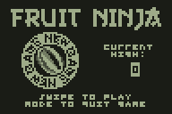
One small experimental calculator project turns out to be far more successful than first hoped. Besides featuring some highly detailed 3D animated graphics, the Fruit Ninja project introduces a strange but satisfying new way to play calculator games—by swiping your fingers across the keypad, as if it's a touchscreen on your calculator.
 And remember back when Google tested those horrible blue buttons? They've brought it back, for good. But now, instead of a massive, glaringly blue bar with bright white text, it's a plain blue button overlaid with a magnifying glass: the centuries-old symbol of searching and finding answers. Put that with the sharply opposing colors of blue and orange, white and dark gray, and it looks ... surprisingly beautiful.


