Ever notice how logos are getting more "modern"—flatter, more symmetrical, and lighter? In some cases it really is an improvement, like with the
Firefox 4 logo. In most other cases, though, I think their owners should have stuck with the old ones. Take Internet Explorer as an example (since we can always laugh at IE):
| Old | New |
|---|
 |  |
Sure, the second one looks shiny and all, but it just doesn't look— Not sure how to say it, but the old one just plain
looked better. To me, at least.
Maybe it's because the old one looks more solid. True, but the second one's realistic too, especially in the new angle of the faint shadow caused by the golden ring. Yet the first one just looks right for some reason.
And Micro$oft isn't the only one doing these redesigning "improvements." Even Google Chrome's logo
has been updated, as I'm sure all Chrome users have noticed by now:
| Old | New |
|---|
 |  |
I know Google cares a lot about simplicity; its homepage is a testament to that, a perfect example of the way a webpage should be limited to exactly what needs to be there. That's what I love about the company, and Apple too: they got the design right. Still, the Chrome team's come up with a new logo that just doesn't look as good. It's not as realistic, certainly, but I don't think that's the problem. Maybe, like with the IE logo, it's not as solid and tangible anymore. Maybe it's too plain. Or maybe it's just that it doesn't look as much
like a Pokéball anymore.
There's another problem I've noticed with the new Chrome logo. It now seems to be lighted exclusively from the top, without that nice reflective shine at the bottom of the old one. That change, plus the fact that the human eye has an affinity for reddish hues, means the top looks larger than the bottom. Not much of a problem there, but when the logo is scaled down to fit on the Vista Quick Launch bar (and yes, I use Vista), it looks like it's looking downward. It's depressing.
Luckily, it seems like Google's
switching back to the old logo with the next release of Chrome, version 12. That means this downward-facing plate's only here for Chrome version 11, which I really think is a relief. I miss that old logo a lot.
What do you think?
(All images are from Wikipedia uploads.)
 ²
²
 New online editor in beta
Like calculator programming? Spend a lot of time online? Following the success of the online ORG assembler, ClrHome is announcing the new Integrated Editor System, an online IDE for TI-BASIC, Axe, and Grammer projects. Integrated image and code editors with inline sprite editing, autocomplete, and many other features helps to simplify programming for calculators online.
 ORG autocompletes!
The ORG online Z80 assembly IDE is now better than ever with such essential editor features as syntax highlighting and instruction autocompletion. As always, the webapp allows you to manage, host, and build your Z80 projects online for a variety of platforms. Or you could simply use it as an easy way to play around with Z80 assembly without ever having to install an editor or assembler.
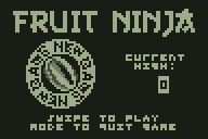
 Fruit Ninja released
One small experimental calculator project turns out to be far more successful than first hoped. Besides featuring some highly detailed 3D animated graphics, the Fruit Ninja project introduces a strange but satisfying new way to play calculator games—by swiping your fingers across the keypad, as if it's a touchscreen on your calculator.


 It's not too much of a playable game, but as promised, I finally got enough done to upload the first PAD of Contra. Download it here!

